Visual cues are the most significant elements of any marketing campaign. When it comes to eye-pleasing designs, we have surpassed the idea of imagery-only copies long back. The dynamic solution certainly comes down to an amalgamation of text, patterns, and images combined. And typography now plays a vital role when it comes to designing an email.
Fonts you use in your emails are an important part of typography. The limitation of cross-platform font support still exists, but email developers are coping up with the situation by finding new and compelling ways to use typography. Fonts in emails are emerging with each passing day, and though it is an old approach in marketing, every year brings in new enhancements. To understand better, let’s indulge in some email templates designed with the latest font-styles.
The Latest Trends in Fonts in Emails
Brands are counting typography as an equivalent to the other graphic aspects in emails. The trend suggests that brands are experimenting with typefaces and bolder fonts as a highlighting factor in email designs. Serif and Sans Serif have been the most loved fonts for a long time. But as the font spectrum widened at the cross-platform email clients, the creative juices started to flow!
Some of the widely-supported cross-platform fonts include:
The families of Helvetica, Arial, Arial Black, Comic Sans, Courier New, Georgia, Impact, Charcoal, Lucida Console, Lucida Sans Unicode, Lucida Grande, Palatino Linotype, Book Antiqua, Palatino, Tahoma, Geneva, Times, Times New Roman, Trebuchet MS, Verdana, Monaco.
The latest trend in emails is to go BIG and BOLD when it comes to typography!
We have compiled a few email templates from the brands that are coming up with some stunning ways to utilize fonts to make a powerful statement in the world of stereotyped, image-based templates. Let’s take inspiration from how they’ve designed captivating templates to give an edge to their campaigns.
1. FEATHER

The home decor brand is flaunting its Helvetica, Arial font-family which is from the list of the accepted ones, and the bold type, overlapping the image design creates a classy appearance of the overall email. This minimal design sends a clear message with a to-the-point email copy.
Pro Tip: There are numerous ways to amalgamate font styles with images. Overlapping fonts and images or even patterns can give you a polished look.
2. J.CREW
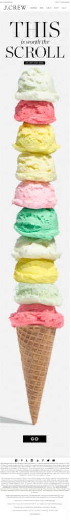
The lifestyle brand J.Crew puts across a really smart summer-collection campaign with a combination of a single image and a one-liner. The font family used here is Verdana. It is commendable how smartly they’ve put the type and image to the use. The curiosity factor is high with such an eye-pleasing email template. The template is loud and precise with a smart twist of CTAs.
Pro Tip: Use the white pace wisely to make the email template elements including your fonts shine through it.
3. RIFLE PAPER CO.
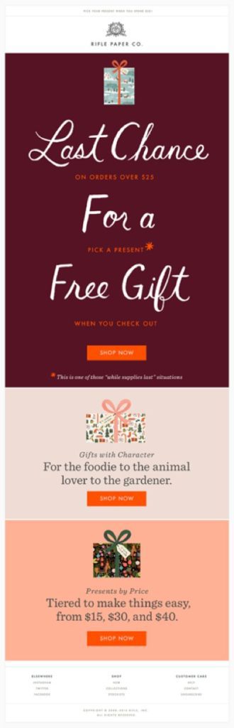
The Futura family fonts create a mesmerizing holiday email template for Rifle Paper Co. This text-only email covers the purpose with no imagery elements at all. The tall and short width of the font placement makes it look appealing and neat.
Pro Tip: When using multiple fonts, mix & match with a bright background can enhance the entire email design.
4. FAB.
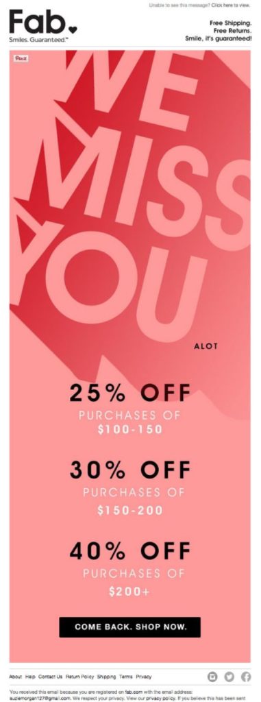
The really chic offer email by FAB is sheer brilliance. Plain text, pastel hues, and amazing use of 3D/shadow font style make it elegant and impactful at the same time. Again a type-only template with bigger text covering the major portion of the email.
Pro Tip: Play with text shapes to put across the message, it will sure make heads turn.
5. Tiffany & Co.
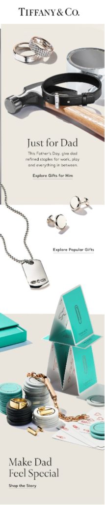
Tiffany & Co. have used Roboto fonts for all the text parts in the template. The use of smart placement of larger texts where necessary stands out and makes this template look sleek & stylish.
Pro Tip: Even if you’re going with a single typeface, the width, size, color, and location of it can make a lot of difference. Highlighting images where necessary and placing taller letters where required, is the way to go about it.
6. J.Renee
We stumbled upon this classy email template by J.Renee – a footwear eCommerce store, which is love at first sight! There are certain elements missing in this particular email template such as the logo, footer, and quick links, but what we liked about this template is how effortlessly, just with a word, they’ve conveyed the promotional message. Typography is all about how you design your fonts to make the template look outstanding. The text-animation here does the job without having to put down any sentences.
Pro Tip: Don’t just stop at width and size and placement of your typeface, make use of the CSS and HTML elements (e.g. animation) to accentuate your fonts.
7. Herschel Supply Co.
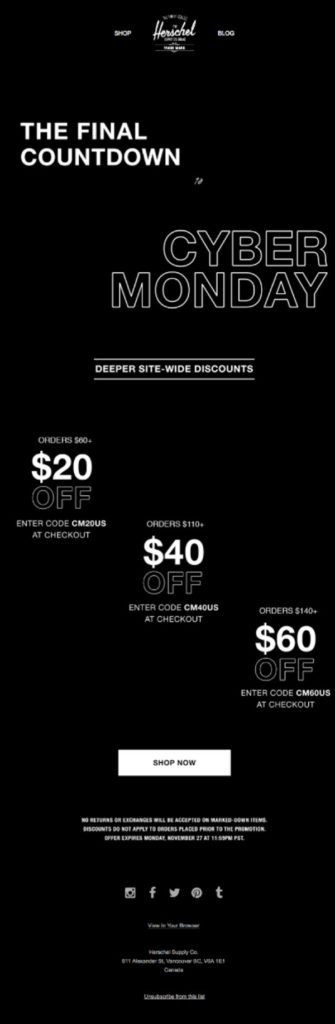
This Cyber Monday template is a class-apart! A completely new concept mending darker hues with highlighted text. The Arial, Verdana family fonts used are proving why classic never goes out of style.
Pro Tip: Dark background with bright fonts is not new, but adding a few typography aspects like zig-zag text placement, border-only or bold fonts, and shades can go a long way.
As far as email marketing is concerned, designers and HTML email developers have always dealt with the responsiveness (and unresponsiveness) of the typeface into different email clients.
The challenge and workarounds
It is not always as easy as putting together any font and typography as we please while crafting an HTML email template. Web fonts are way easier to deal with than to face the email font challenges.
Using fonts in email can be tricky and essential at the same time! The majority of the email clients, by default, block the images from the first-time senders. In that case, the recipients will see a text-only version. The challenge here is that you are left with only the basic, cross-platform fonts to come up with an all-compliant, responsive, and email clients approved email template. To combat this issue, there are certain precautions that email template designers can take.
- When it comes to HTML emails, the designers should choose and shuffle wisely between the safe, cross-platform typefaces.
- Whenever you try to play with a unique font, never miss out on selecting a fallback font.
- A small but significant amount of email clients support web font services like Google Web Fonts. Email template designers can make use of this workaround if need be.
- As a last resort (though useful for many), you can use modern fonts within the graphic and then upload them as images in your templates. The image-render issue still persists, but the brands with good email deliverability can utilize this method.
Wrap Up
The bigger and bolder fonts are trending in the email marketing marketplace, and utilizing them aptly in every way possible is the new cool! I hope the examples above will help you think of more creative ways to use fonts in your future campaigns.
Author Bio
Kevin George is Head of Marketing at Email Uplers, one of the fastest-growing PSD to Email coding companies, and specializes in crafting professional email templates, custom Mailchimp email templates design and coding in addition to providing email automation, campaign management, and data integration & migration services. He loves gadgets, bikes, jazz, and eats and breathes email marketing. He enjoys sharing his insights and thoughts on email marketing best practices on his blog.