Imagine a situation where you walk into a grocery store to shop for your family. You, however, get a bad odor in the store, shelves that are disorganized, and different stains on the floor. Do you think you can still buy from this grocery store? The same will be the case with your website design.
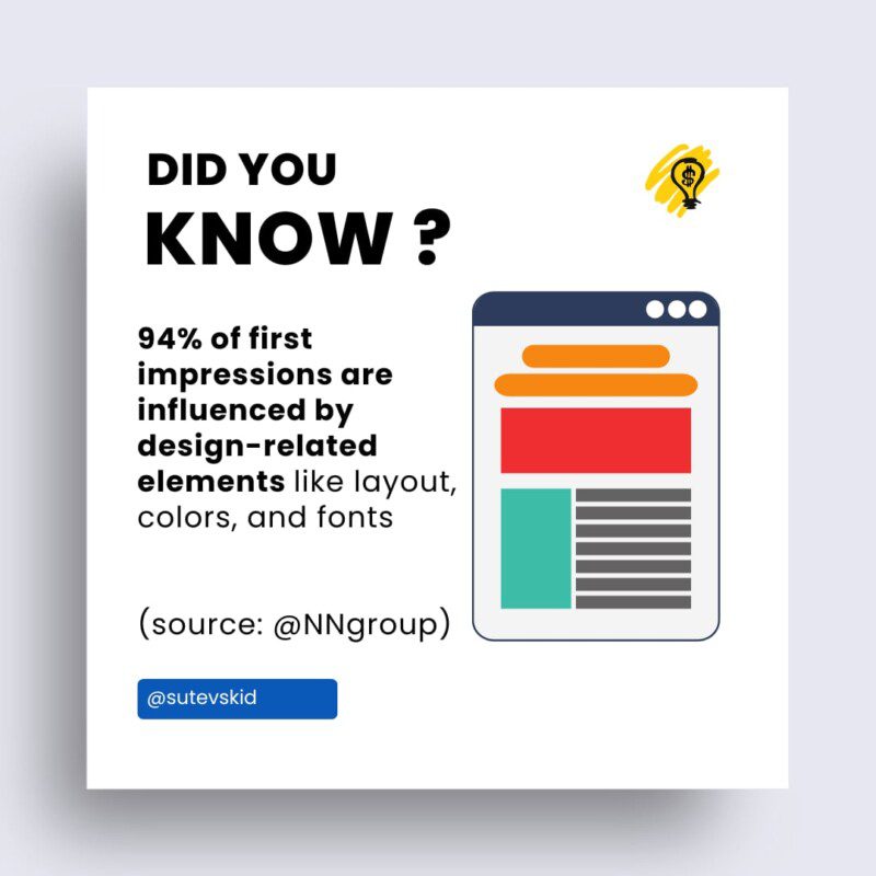
Chances are you would look for another grocery store. The design of a store has an effect on the behavior of customers. The same thing applies when it comes to websites. According to a survey, more than 80% of website visitors notice an up-to-date and aesthetically pleasing website.
Just like you would leave a disorganized grocery store, more than half of your website visitors will leave your website if they are not happy with its design and content. Here are some core principles of a great website design with examples.
1. Fast and Easy Navigation
If you are building a website for your business for the first time, you might be confused, especially when evaluating the most important features you should look at. Well, fast and easy navigation is something you should pay special attention to.
Let us start by doing a simple search on Google about manual cars. We will get different websites on the first page with information on what we want. Let us click on the highest-ranked website. Unfortunately, we are not able to locate the information we want.
Chances are that we will hit the back button and see if we can get the same information on another website. You can find an example of fast and easy navigation on The Cool Club website. The website offers a great layout that allows you to navigate through different sections easily using either the right-hand side or left-hand side menu options.
2. Your Website Should Make it Really Easy to Get in Touch
You have started a new law firm and done everything you need to do to get your business where it is supposed to be. You have also created a website, listed all the services that you provide, and added any other information that your website visitors might need.
Let us assume that I am a client looking for an attorney to handle issues with my car insurance. I have checked your website and realized you have listed what I am looking for in the services section. What do you think my next step will be?
Of course, I will want to get in touch with you. However, your website design makes it difficult for me to get in touch. Chances are that I will start looking at your competitors. These credible law firm websites show how easy you need to make it for your clients to get in touch when navigating through your website.
3. Check Out Negative Space
Your website has different elements and subjects. The region that exists around these subjects is referred to as negative or white space. What do you think you should do with this space? Should you just leave it blank or add more information or content to it?
No matter how enthusiastic you think you might be, you should not fill these spaces with just anything that comes to your mind. You might think that you will keep your website visitors engaged if you provide them with as much information as possible.
On the contrary, you might just confuse or overwhelm them. You, therefore, need to use negative space in a way that emphasizes the subjects on your pages. If you look at the Garoa Skincare website, they have used their brand colors around web page subjects to make them look much better.
4. Use Complementary Colors
Complementary colors can be defined as the different colors you can easily mix without making your website look ugly or overwhelming. You should ensure you have followed the RGB (Red, Green, Blue) color model instead of the CMYK (Cyan, Magenta, Yellow, Black) color model.
If you are a painter, for instance, the CMYK and RYB (Red, Yellow, Blue) color models will work wonders for you. For your website, you need the RGB color model. That notwithstanding, you should ensure that you have used complementary colors to elevate and create the correct brand identity.
Let us look at the Swab The World website. You will realize that this website uses green and magenta. However, as you navigate to other sections of the website, these colors change seamlessly to different color combinations. This is a perfect example of using complementary colors.
5. Create Engaging and Consistent Pages
If you are a sports fanatic, you have most likely heard about brands such as Nike and Adidas. If you take soft drinks, then brands such as Coca-Cola are not new to you. What do you think make these brands so successful?
Check out the design styles, fonts, or even logos that these brands have. These are some of the things that will come to your mind when you think about them.
Similarly, you need to look at these things when designing your website. Your website pages should not only be engaging but also consistent to ensure that your brand has a good visual identity. This way, you will keep your customers and even convince new ones to navigate through the website even though you have only a couple of seconds to do so.
Designing a website that gives your business an edge over competitors is not a walk in the park. However, you can stand a chance of beating them at their own game by implementing the principles discussed in this article.