Apps are everywhere in today’s digital-first world. Almost half of all people open an app 11 or more times a day. By 2023, mobile apps are expected to gross over $935 billion worldwide.
As a digitally-savvy entrepreneur, building your own app could be the best way to make your mark on the modern mobile landscape and start positioning yourself as a leader in your space. However, before you can start making your fortune, you’ll have some crucial planning to do.
While a number of factors can influence how successful your app design might be, one of the most important is the app’s user interface (UI). Simply put, if your app isn’t intuitive enough, your customers won’t experience any sense of value and they simply won’t continue to use it.
So, how do you design the perfect UI?
Interface Learnings from the World’s Leading Apps
In the long term, you can use the data you collect from your users’ interactions with your app to optimize and improve the interface experience. In the meantime, however, if you’ve yet to build and launch your product, that isn’t an option. Therefore, the best way to make sure you’re setting yourself up for success is to learn from the world’s top grossing apps.
The most successful mobile products are effective because they know how to deliver a phenomenal experience to their target audience.
Here are just a few lessons you can use in your app design.
Know Your Users
The most important thing you can do to guarantee a great user experience on any app is to get to know your target user. That means understanding exactly what pains your potential customers, and what they’re hoping to accomplish when they download and install whatever you create.
Look at the Google One app, for instance, currently, the number one paid app for Android. Google didn’t just create app users could use to back up their phones, they gave them a tool for backing everything up automatically because they knew their users are busy people, likely to forget to do a manual back-up themselves.
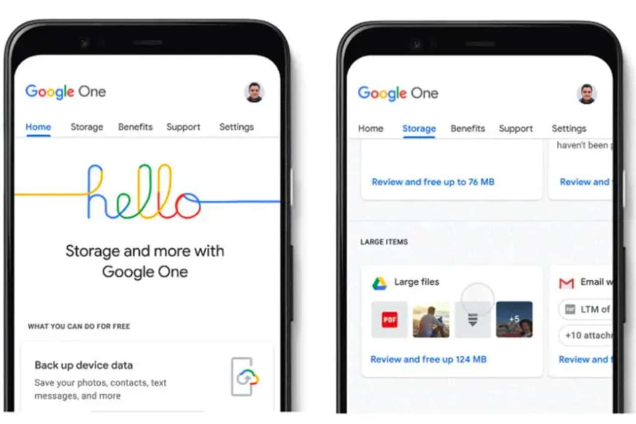
Google One also ensured its customers had access to a range of different types of subscription plans, to suit individual needs. For instance, you can get higher levels of storage if you’re storing important projects, photos, and videos, or you can distribute your Google One storage among up to five people if you want to get your entire family up and running.
When creating your own app, ask yourself how people are likely to leverage your technology, and how you can make life easier for them. If you have more than one buyer persona, think about how you can offer different plans and service packages to suit each group.
Consider How People Expect to Use Your Interface
Before you design an interface for your newly defined target audience, you’ll need to think carefully about how people will expect to use it. The increasing prevalence of gesture-reading touchscreen devices means you can expect most people will want to swipe and tap their way through your menus.
Depending on your audience, you can usually anticipate what kind of interactions your customers will be most used to. For instance, TikTok, ranking today as the fourth most popular mobile app, knows most of its younger users will be used to the swiping gestures common on apps like Instagram and Tinder.
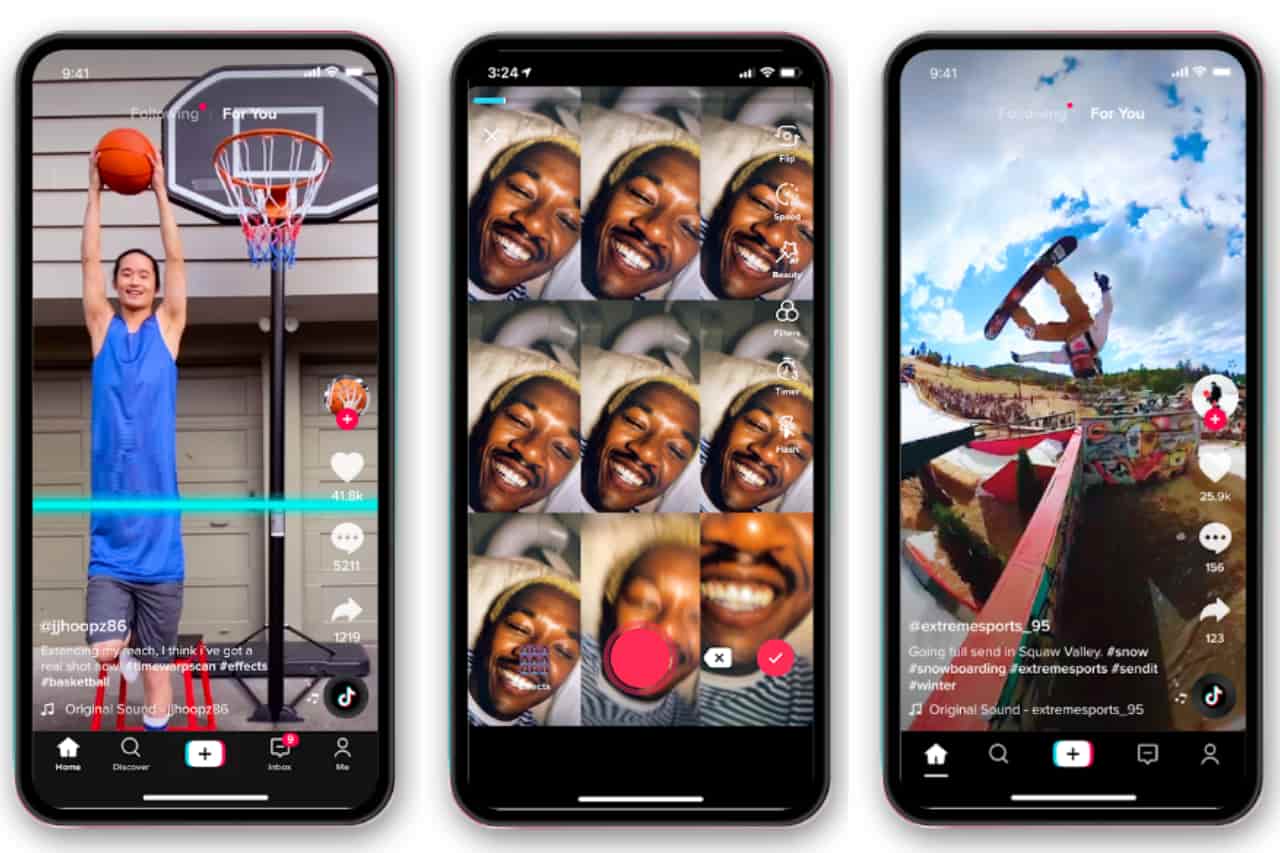
Because of this, the TikTok interface uses common navigation options that feel intuitive to their audience. You can swipe to the right if you find a video entertaining and want to learn more about the person behind it. You can double-tap on a video if you want to give it a “Like” just like you would on an Instagram photo or video too.
Make Your Interface Easy to Learn
People want apps to be simple, intuitive, and often enough, simply fun. With that in mind, it shouldn’t take forever to learn how to use your interface. Starting with the gestures and navigation options that your customers are likely to expect is a good start, but it’s also worth offering extra guidance and support along the way.
For instance, the Candy Crush Saga app keeps things fun and exciting for its users by regularly introducing new elements to the game, like special pieces of candy which can do different things.
Rather than leaving customers to figure out what everything does on their own, the company ensures that each new feature comes with simple instructions on how to use it. Micro-animations and guidance mean users can quickly and conveniently get to grips with features, without being overwhelmed.
While you don’t need to explain everything to your audience, you should provide plenty of support and guidance when it might be useful.
Choose Element Placement and Size Carefully
Finally, remember that for the most part, your customers are going to be interacting with your apps on a relatively small screen. This means you need to size and place elements as effectively as possible for a compact space.
The HBO Max app, the fifth most popular in the world, doesn’t just copy the same experience you get from the app on your smart television onto a phone screen. Instead, it allows users to easily scroll through television and movie content options with their fingers, and tap into different options to learn more.
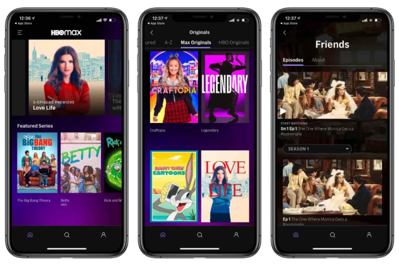
Each element you can interact with on the HBO app also offers instant feedback, so users know what they’ve pressed at the moment. This allows for a more immersive experience.
📖 More similar articles…
Learn from the Top Apps to Make Your Own
A great app needs an amazing interface if your customers are going to use it. Fortunately, you don’t have to reinvent the wheel as a new entrepreneur. There are plenty of lessons you can learn just by using the top grossing apps as inspiration. Start with getting to know your audience, implement interface elements your customers will expect, then make your app design simple and easy to use. You’ll be on your way to success in no time.